White’s Illusion
Every gray bar is identical, but the striped pattern makes the left group appear lighter than the right.
Look at the two groups of gray bars below. The bars on the left may appear noticeably lighter, while those on the right look darker or more charcoal-colored.
But every gray rectangle has exactly the same RGB value. None has been brightened, darkened, shaded, or made transparent.
The only difference is where each bar appears within the black-and-white pattern.
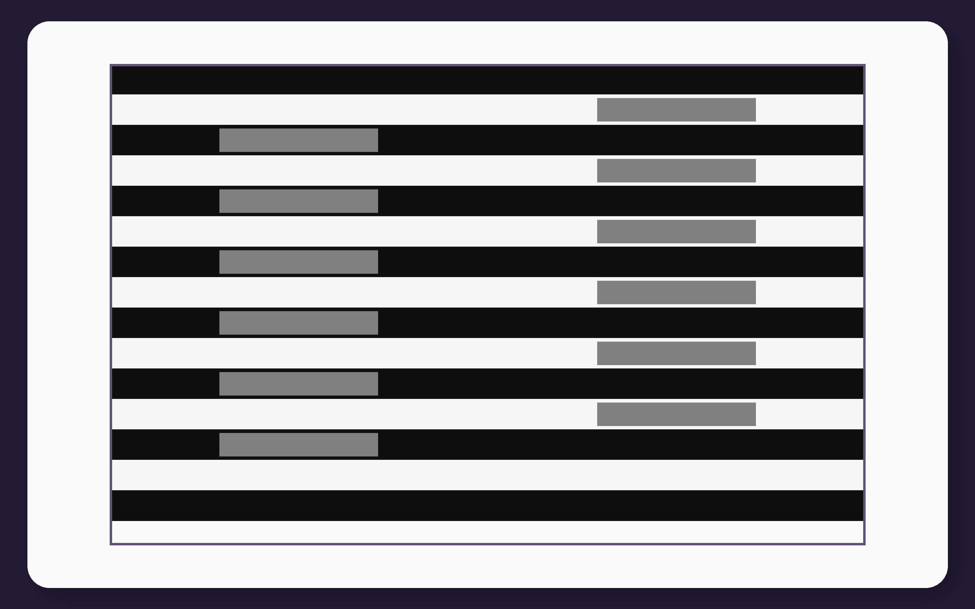
This is White’s illusion, a lightness illusion named after psychologist Michael White.
It is especially important because it behaves opposite to what a simple contrast explanation would predict. The gray bars surrounded mainly by white appear lighter, not darker. Those surrounded mainly by black appear darker, not lighter.
What Is Actually Different?
The display consists of alternating horizontal black-and-white stripes.
The left gray bars replace sections of black stripes. Long white borders run above and below them, while black sections continue from their ends.
The right gray bars replace sections of white stripes. They are bordered above and below by black, while the white stripe continues from their left and right ends.
Every target has the same width, height, and mid-gray fill. Only its relationship to the surrounding stripes changes.
That organization is enough to produce a surprisingly strong difference in apparent lightness.
Why Simple Contrast Predicts the Wrong Result
In ordinary simultaneous contrast, a gray patch placed against white tends to look darker. The same gray against black tends to look lighter.
White’s illusion reverses that expectation.
The left targets share most of their border with white stripes, yet they commonly appear lighter. The right targets share most of their border with black stripes, yet they appear darker.
This is why the illusion became an important test for theories of lightness perception. A mechanism based only on the brightness of immediate neighboring pixels cannot explain the result easily.
Michael White introduced the simplified pattern in his 1979 paper, “A New Effect of Pattern on Perceived Lightness”.
The Bezold Effect produces a related form of assimilation in color patterns, where a repeated surrounding color shifts the appearance of physically identical target colors.
How to Prove the Gray Bars Match
The proof image connects one bar from each group with a continuous mid-gray bridge. The bridge and both targets use exactly the same color.
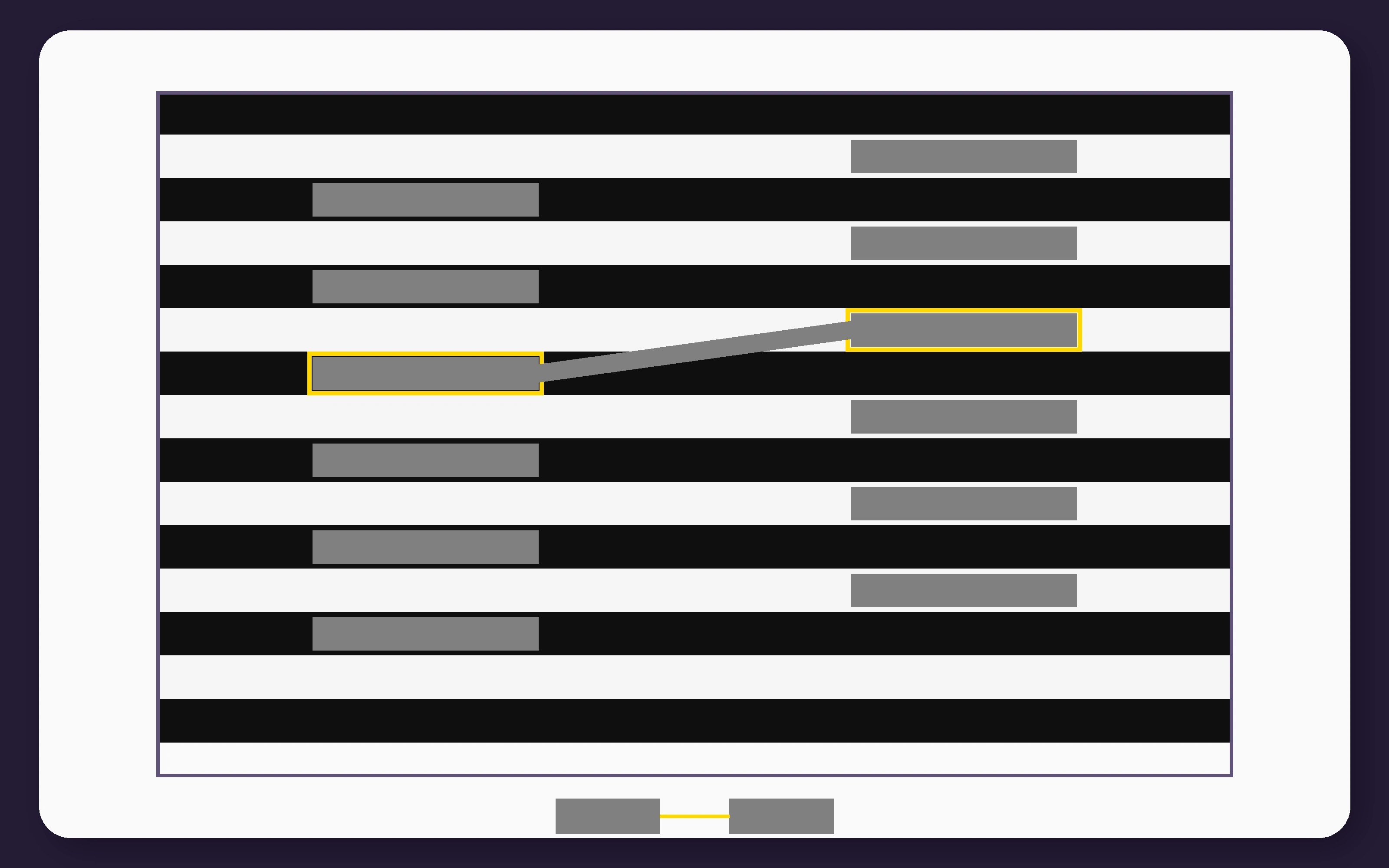
You can also cover the surrounding stripes while leaving only the gray targets visible. Once the black-and-white context disappears, the apparent difference becomes much weaker.
Restore the stripes, and the lighter-left, darker-right appearance usually returns immediately.
Is the Effect Assimilation?
One way to describe the illusion is through lightness assimilation.
The left gray bars appear to shift toward the white pattern that dominates their long borders. The right bars appear to shift toward the black pattern surrounding most of their length.
That description captures the direction of the effect, but it does not fully explain how the visual system produces it.
In his history of the illusion, White explained that researchers have proposed low-level, middle-level, and higher-level accounts. No single explanation has achieved universal agreement.
Colored versions produce related shifts in hue rather than gray lightness. Cognitive Train’s Color Hue Test presents genuine color differences and asks you to arrange them into smooth gradients without misleading striped context.
Do T-Junctions Explain the Illusion?
The corners of each gray rectangle form T-shaped junctions with the background stripes.
T-junctions often indicate that one surface passes in front of another. That led researchers to propose that the gray bars are organized as surfaces layered over or behind the striped background.
Barton Anderson developed a perceptual-organization account in which the image is separated into different surface layers. In his study of White’s illusion, he showed that changing the figure-ground organization could dramatically alter the apparent lightness of the targets.
However, junctions cannot be the whole story.
In a 2005 experiment by Piers Howe, circular versions of White’s effect remained strong even when the usual T-junctions were removed.
The background pattern was still important, but the illusion survived without the corner structure that some theories treated as essential.
Try a Related Contrast Test
White’s illusion changes the apparent brightness of clearly visible objects. Contrast sensitivity asks how faint an object can become before you can no longer distinguish it from its background.
Cognitive Train’s test gradually reduces the contrast of a large letter to estimate the faintest difference you can still detect:
Where the Illusion Came From
White did not begin with the simple striped figure now associated with his name.
In early 1976, he encountered a more complicated black, white, and gray design created by student Susan Hirth and reproduced in an optical-art book.
Physically identical gray regions in that design appeared different in lightness. White simplified the arrangement repeatedly to isolate the features responsible for the effect.
The resulting striped display was published in 1979 and became known as White’s illusion.
Its colored relative is often called the Munker-White illusion. In that version, identical colors appear different because they are woven into different surrounding color patterns.
How It Differs From Other Brightness and Color Illusions
Both White’s illusion and the Checker Shadow Illusion make physically identical gray regions look different.
The Checker Shadow illusion uses a three-dimensional scene with an apparent shadow. The visual system interprets one square as being under reduced illumination and compensates for that shadow.
White’s illusion contains no cylinder, cast shadow, or realistic lighting scene. It is a flat striped pattern whose effect depends on grouping and surface organization.
The Watercolor Illusion and Neon Color Spreading Illusion also change the appearance of physically unchanged regions. Instead of altering gray lightness, they make color appear to spread from narrow inducing elements across much larger white surfaces.
These illusions reveal several different routes by which surrounding structure can change perceived surface color and brightness.
Why Knowing the Answer Does Not Remove the Effect
You can inspect the proof, measure the pixels, and confirm that all the gray bars match. The two groups may still look different when you return to the complete pattern.
Your conscious judgment now knows the correct value, but the visual system continues organizing the targets relative to their surroundings.
This is why lightness illusions are more than failures of reasoning. The difference is present in the visual experience itself.
The brain does not simply report how much light each isolated region sends to the eye. It estimates which surfaces belong together and how the complete pattern should be interpreted.
What It All Comes Down To
White’s illusion places identical gray bars inside alternating black-and-white stripes.
The bars grouped mainly with white appear lighter, while those grouped mainly with black appear darker. That direction contradicts the simplest local-contrast prediction.
The effect shows that perceived lightness depends on spatial organization, grouping, boundaries, and the broader pattern, not just the brightness of the nearest pixels.
For more examples of brightness, color, size, line, and depth distortions, browse the full Optical Illusions guide. Cognitive Train’s brain tests explore perception, attention, processing speed, and reasoning, while its free brain training tools offer more ways to challenge visual judgment.