Bezold Effect
The red tiles are identical in both mosaics, yet the left pattern may look lighter and the right pattern darker.
Look at the two tiled panels below. Does the red on the left appear brighter, lighter, or slightly pinker than the red on the right?
The right-hand red may look deeper, darker, or more saturated by comparison.
But every red tile in both panels uses exactly the same RGB value. Only the thin lines running between the tiles are different.
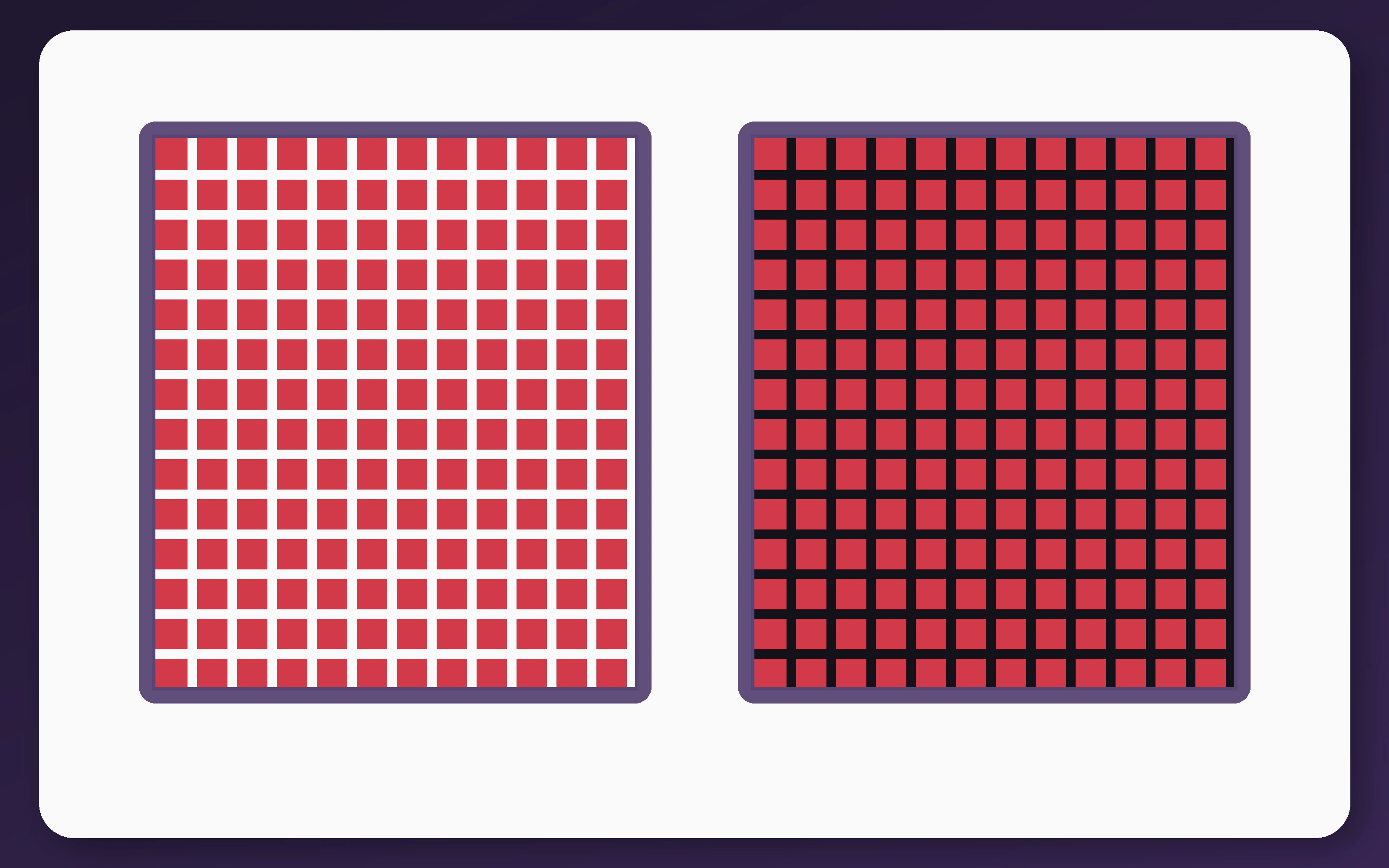
This is the Bezold effect, also called the von Bezold spreading effect or color assimilation.
When small regions of one color are repeatedly interspersed with another, the first color can appear to shift toward the second. The red mixed visually with white looks lighter, while the same red mixed with near-black looks darker.
The effect is closely related to the colored forms of the White’s Illusion, where identical targets also shift toward surrounding striped elements.
What Is Actually Different?
Both mosaics begin with one continuous field of the same red.
A fine grid is then placed over each field. The left panel uses white grid lines, while the right panel uses very dark lines. Their spacing and thickness are identical.
The red tiles have not been recolored individually. They have the same hue, saturation, brightness, dimensions, and spacing in both panels.
Even so, the complete mosaics can look as though they were made from two different reds.
The visual system does not preserve the target color independently from the pattern surrounding and dividing it. It combines information across the closely interwoven colors.
The Proof: The Red Tiles Match Exactly
The proof image selects one red tile from each panel and connects them with a strip made from the same red.

The bridge makes the equality easier to see because it temporarily joins the targets into one continuous surface.
The two isolated swatches at the bottom also match. Remove them from their surrounding grids, and the apparent difference largely disappears.
Why the Colors Shift Toward Their Neighbors
The Bezold effect is a form of color assimilation.
Assimilation means that a target’s appearance shifts toward the color of a nearby inducer. In this image, the red appears to take on some of the lightness of the white grid or some of the darkness of the black grid.
The lines are narrow and repeated at a high spatial frequency. Your visual system cannot treat every red tile and every grid segment as completely independent.
Instead, neighboring signals are combined across the pattern. From a distance, this can resemble optical color mixing: red plus white trends toward a lighter pinkish red, while red plus black trends toward a darker red.
This does not mean the eye literally averages every pixel. The percept depends on arrangement, scale, luminance relationships, grouping, and visual pathways.
Why Small Repeated Patterns Work Best
The Bezold effect is generally strongest when the inducing color is broken into narrow lines or small elements closely interspersed with the target.
When colored regions become larger and sit beside one another as separate surfaces, perception can shift toward color contrast instead.
In contrast, a target tends to look less like its surround. In assimilation, it looks more like the nearby inducer.
This means that changing only the scale or arrangement of a pattern can reverse the direction of the perceptual effect.
The Colour and Vision Research Laboratory demonstrates the difference: broad neighboring areas tend to produce contrast, while finely interspersed elements can produce von Bezold color spreading.
Spatial Width Changes the Strength
The influence of nearby color does not spread equally across every distance.
In a study of spatial dependence in color assimilation, researchers measured shifts across patterns ranging from narrow von Bezold-type arrangements to much wider Watercolor-effect regions.
The strongest assimilation occurred across narrow regions. As the width increased, the measured hue shift declined substantially.
This supports the idea that tightly interwoven colors are especially effective. The white and dark lines in the current demonstration repeatedly pass close to every red tile.
The Watercolor Illusion can spread color over a much broader area because it uses a continuous enclosing boundary rather than relying only on narrow repeated mixing.
Luminance Differences Are Important
The effect does not depend only on choosing two different hues.
The light-dark relationship between the target and the inducing pattern can strongly affect whether assimilation appears.
In a 2018 psychophysical study, researchers tested striped surrounds while systematically changing luminance differences.
They found that luminance differences were important for producing assimilation in several tested conditions. Some equiluminant arrangements produced weaker assimilation, no shift, or contrast instead.
A later study of luminance and chromatic channels concluded that the effect could not be explained as a purely color-to-color interaction.
The results pointed to interaction between chromatic information and luminance-processing channels.
That is why this demonstration uses a bright white grid and a very dark grid rather than two surrounding colors with similar brightness.
Test Your Color Discrimination
The Bezold effect makes identical colors look different because of their context. Cognitive Train’s Color Hue Test presents genuine hue differences and asks you to arrange colored swatches into smooth gradients.
The related Contrast Sensitivity Test measures how faint a real luminance difference can become before it disappears into the background.
Can Depth Reverse the Effect?
The spatial arrangement does not have to be interpreted as one flat printed surface.
In a 2010 stereoscopic study, researchers placed the target and inducing regions at different perceived depths.
Under some conditions, the usual assimilation effect reversed into contrast.
This suggests that color appearance depends partly on perceptual organization. Signals occupying the same physical image can influence one another differently when the visual system assigns them to separate depth planes.
The Bezold effect is therefore not caused only by neighboring pixels in the retinal image. How those pixels are grouped into surfaces also matters.
Where the Bezold Effect Came From
The effect is named after German physicist and meteorologist Wilhelm von Bezold.
In nineteenth-century work on color, Bezold described how changing one color within a finely patterned design could alter the appearance of other colors across the complete composition.
The phenomenon became relevant to textiles, mosaics, printing, and decorative patterns, where a designer could change the visual character of a large design by replacing only one recurring thread or small repeated element.
Michael Bach’s color-assimilation demonstration shows how repeated grid colors can pull identical disks toward different apparent mixtures.
How It Relates to Other Color Illusions
The White’s Illusion uses identical gray targets placed within black-and-white stripes. Colored Munker-White versions closely resemble the Bezold effect because targets appear shifted toward crossing or surrounding bands.
The Neon Color Spreading Illusion also uses color assimilation, but its inducing segments collectively form a transparent-looking virtual surface.
The Watercolor Illusion uses adjacent colored contours to spread a faint hue through an enclosed region.
The Checker Shadow Illusion changes apparent lightness through a realistic interpretation of illumination rather than fine color mixing.
Why the Whole Pattern Can Seem Recolored
The Bezold effect is often experienced globally.
You may not merely see individual tiles as slightly lighter or darker. The entire left mosaic can feel softer and brighter, while the right mosaic seems heavier and deeper.
This is useful in visual design because a small repeated color can change the apparent palette of a large surface.
It can also be misleading. Two fabrics, screens, or printed patterns may appear to use different main colors even when their dominant target color is identical.
Why Knowing the RGB Value Does Not Remove It
After seeing the proof, you know that every red tile matches.
The two mosaics may still look different when you return to the original image.
Your conscious reasoning identifies the source color correctly. Your visual system continues combining that color with the fine white or dark pattern surrounding it.
The illusion persists because color perception is relational. The brain represents a surface within its spatial context rather than reading out one isolated RGB value.
What It All Comes Down To
The Bezold effect occurs when one color is finely interspersed with another.
The repeated neighboring color pulls the target’s appearance toward itself. Identical red tiles look lighter beside white lines and darker beside black lines.
The effect depends on pattern scale, spacing, luminance differences, depth organization, and how the visual system groups the colors into surfaces.
For more examples of color, brightness, size, depth, and line distortions, browse the full Optical Illusions guide. Cognitive Train’s brain tests explore perception, attention, processing speed, and reasoning, while its free cognitive training tools offer more ways to challenge visual judgment.