Watercolor Illusion
The region inside the wavy border is pure white, yet it may appear covered by a pale orange wash.
Look at the large enclosed area below. Does the interior seem slightly warmer or more orange than the white area surrounding it?
There is no colored fill inside the shape. Every pixel away from the contour is pure white, exactly like the background outside it.
The apparent tint comes from the narrow orange line running immediately inside the darker purple border.
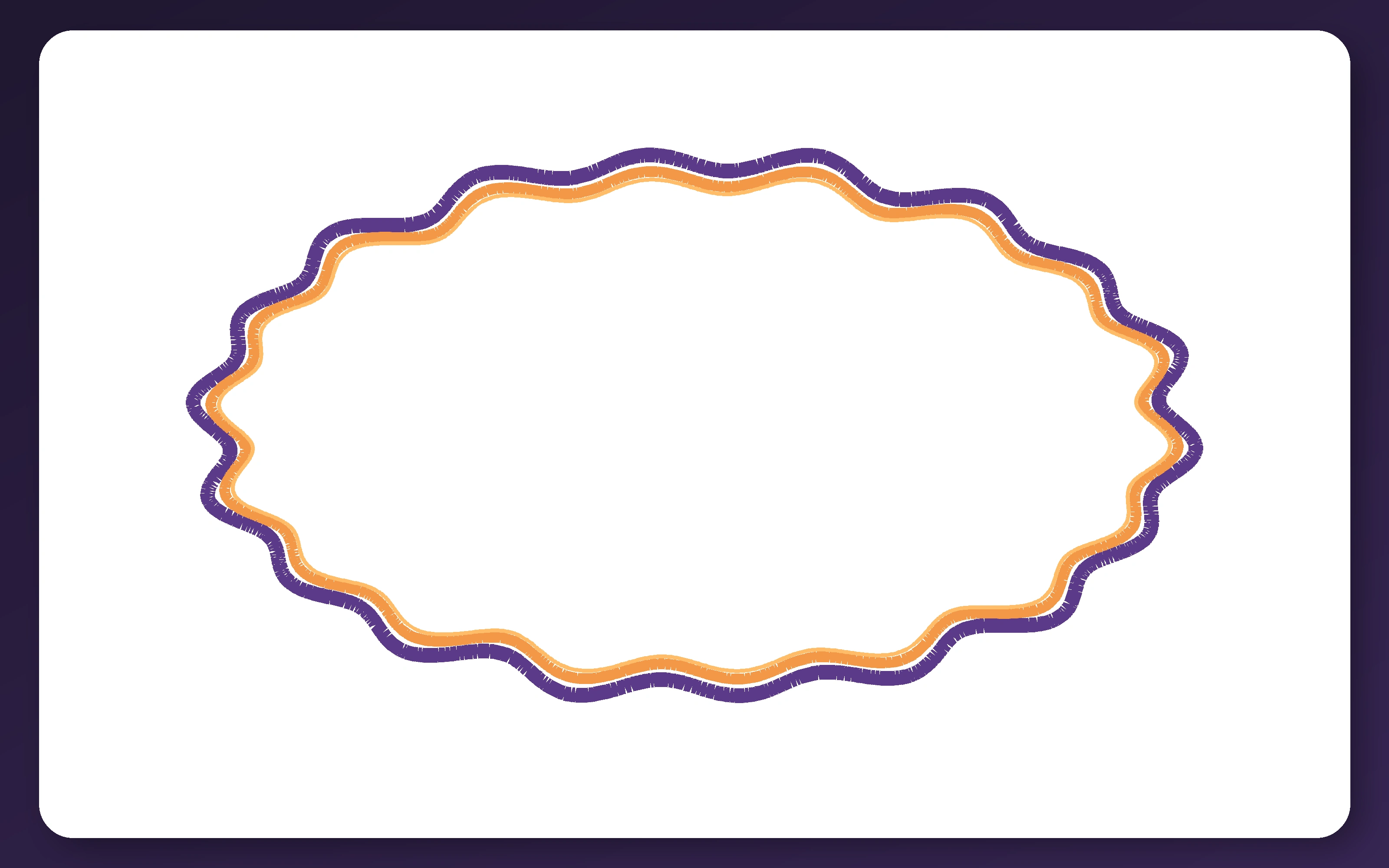
This is the Watercolor illusion, also called the Watercolor effect.
A pair of neighboring colored contours can make color appear to spread across a much larger enclosed surface. The border can also make that region seem more solid and clearly separated from the background.
It is one of several color and brightness effects collected in Cognitive Train’s Optical Illusions guide.
What Is Actually Colored?
The physical color is confined to the dark-purple outer contour and the orange lines immediately inside it.
The broad interior remains white from edge to edge.
However, the orange may appear to leak inward, producing a weak veil of color across an area hundreds of times wider than the inducing line.
The tint is often strongest near the boundary and subtler toward the center. Depending on your screen and viewing distance, it may resemble a pale wash, a softly painted surface, or simply a warmer white.
The effect is easier to notice by comparing the enclosed area with the white space near the corners. Detecting subtle real differences in brightness rather than illusory ones is the challenge measured by Cognitive Train’s Contrast Sensitivity Test.
The Proof: Inside and Outside Use the Same White
The proof image marks one point inside the shape and another outside it. The two sampled regions are reproduced as white swatches at the bottom.
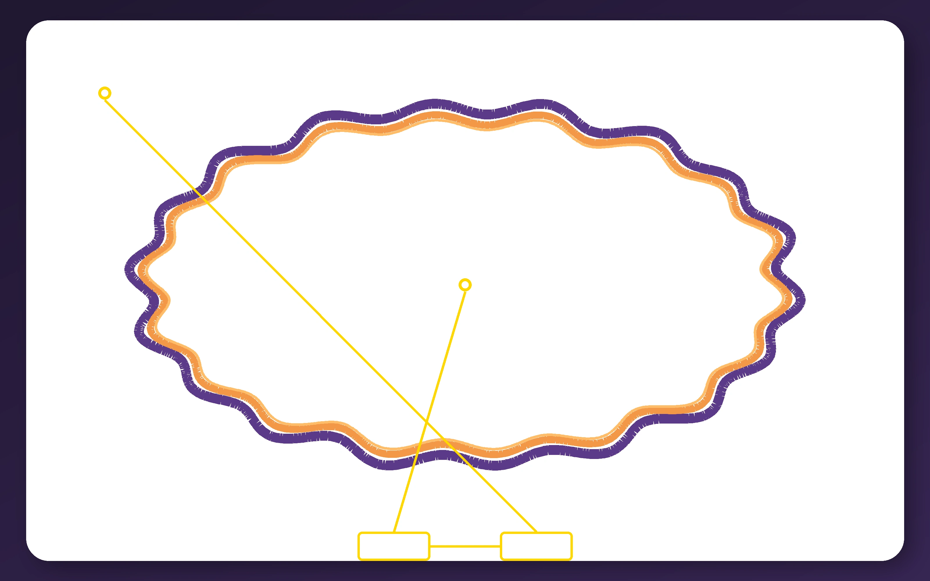
The gold markings do not identify two approximately similar shades. They point to pixels with identical values.
Remove the markings and return to the original image, and the enclosed area may again take on the orange contour’s hue.
Why Two Neighboring Contours Matter
The effect becomes especially strong when a lighter colored contour is placed directly beside a darker one.
In the classic arrangement, the lighter line lies on the side of the region that becomes tinted, while the darker line sits outside it. The enclosed surface tends to take on the hue of the lighter inner contour.
Baingio Pinna, Gavin Brelstaff, and Lothar Spillmann examined this construction in their 2001 study of surface color from boundaries.
They found that thin, winding contours with suitable contrast produced particularly strong spreading. The effect could extend across a large enclosed area even though the inducing color remained physically restricted to the edge.
The researchers proposed that interactions near the paired contours weaken the boundary on one side, allowing the lighter color signal to influence the surface enclosed by it.
This is not literal pigment moving across the screen. The orange pixels stay at the boundary while the visual system represents the larger region as faintly orange.
Why the Lines Are Wavy
The illusion can occur with straight contours, but wavy lines often make it stronger.
An undulating boundary creates many changing orientations and repeatedly places the two colors in close contact along a long path. It also makes the enclosed area feel like one distinctive shape.
The important features are the close pairing of the contours, their contrast, their continuity, and the fact that they form a boundary around a region.
The White’s Illusion shows another way that surrounding structure can alter a physically unchanged surface, although it changes apparent gray lightness rather than spreading color.
The Bezold Effect also shifts perceived color through assimilation, but it uses finely interspersed repeated elements instead of one continuous enclosing contour.
Spacing Can Rapidly Weaken the Effect
The two contours work best when they closely hug each other.
In a 2009 spacing experiment, Frédéric Devinck and Lothar Spillmann inserted gaps between the inducing contours.
The apparent color spreading decreased rapidly as the distance between the lines increased.
The researchers also replaced continuous contours with chains of dots. Increasing the spacing between those dots weakened the measured color shift again.
The strongest Watercolor effect therefore came from contours that were both close together and spatially continuous.
This explains why the purple and orange lines in the demonstration nearly touch. Pulling them apart would preserve the same colors and overall shape while reducing the illusory wash.
Test Your Color Discrimination
The Watercolor illusion adds an apparent tint that is not physically present. Cognitive Train’s Color Hue Test measures a different ability: detecting and ordering small hue differences that really are present.
The Border Can Also Create a Figure
The illusion does more than add color.
The enclosed region may appear to stand forward as one solid surface, while the surrounding white area recedes into the background. The boundary seems to belong to the tinted region rather than equally separating two flat white areas.
This is called figure-ground organization. The visual system decides which side of a boundary belongs to an object and which side continues as background.
It would be reasonable to assume that the figure appears only because the interior looks colored. Research suggests that the relationship is more complicated.
In experiments by Rüdiger von der Heydt and Rachel Pierson, physically adding matching color to comparison regions reduced the Watercolor pattern’s advantage as a figure but did not eliminate it.
The researchers concluded that apparent coloration and figure-ground organization are supported by at least partly independent processes.
The same border can therefore contribute both to a faintly colored surface and to a stronger sense that the enclosed area is an object.
How It Differs From Neon Color Spreading
The Watercolor illusion and the Neon Color Spreading Illusion both create broad color effects from narrow inducing elements.
Watercolor coloration is normally produced by two adjacent contours of different colors. The resulting surface often looks opaque, solid, and owned by an enclosed figure.
Neon color spreading usually occurs where differently colored segments continue through a larger pattern. The induced region can look luminous, transparent, or like a colored veil floating over the background.
In a 2005 analysis by Pinna and Stephen Grossberg, the authors examined intermediate patterns connecting the two effects.
They proposed that nearby color transitions may contribute to both while different global boundary structures determine whether the completed surface appears transparent or solid.
How It Differs From the Checker Shadow Illusion
The Checker Shadow Illusion also makes physically identical regions appear different, but it depends on a realistic lighting interpretation.
The visual system treats one square as being in shadow and compensates for the reduced illumination.
The Watercolor illusion does not need a cast shadow, recognizable object, or three-dimensional scene. Its surface color is constructed from a flat arrangement of adjacent contours.
Both effects show that perceived color and brightness are not determined by isolated pixel values. Surrounding structure changes what a region looks like.
Why Knowing the Interior Is White Does Not Fix It
You can inspect the proof image, sample the pixels, and confirm that the interior and exterior are identical.
The interior may still look faintly tinted when you return to the original display.
Your conscious knowledge describes the digital file correctly. The perceptual system is solving a different problem: deciding what surface lies inside the boundary and what color belongs to it.
By the time the image reaches awareness, the white region may already have been represented as a softly orange figure.
What It All Comes Down To
The Watercolor illusion uses a light colored contour placed directly inside a darker contour.
The enclosed white area appears to absorb the lighter line’s hue, while the boundary also makes that area feel like one distinct figure.
The color is not physically painted across the surface. It is constructed from the relationship between narrow edges and the broad region they enclose.
For more examples of color, brightness, size, line, and depth distortions, browse the full Optical Illusions guide. Cognitive Train’s brain tests explore perception, attention, processing speed, and reasoning, while its free brain training tools offer more ways to challenge visual judgment.